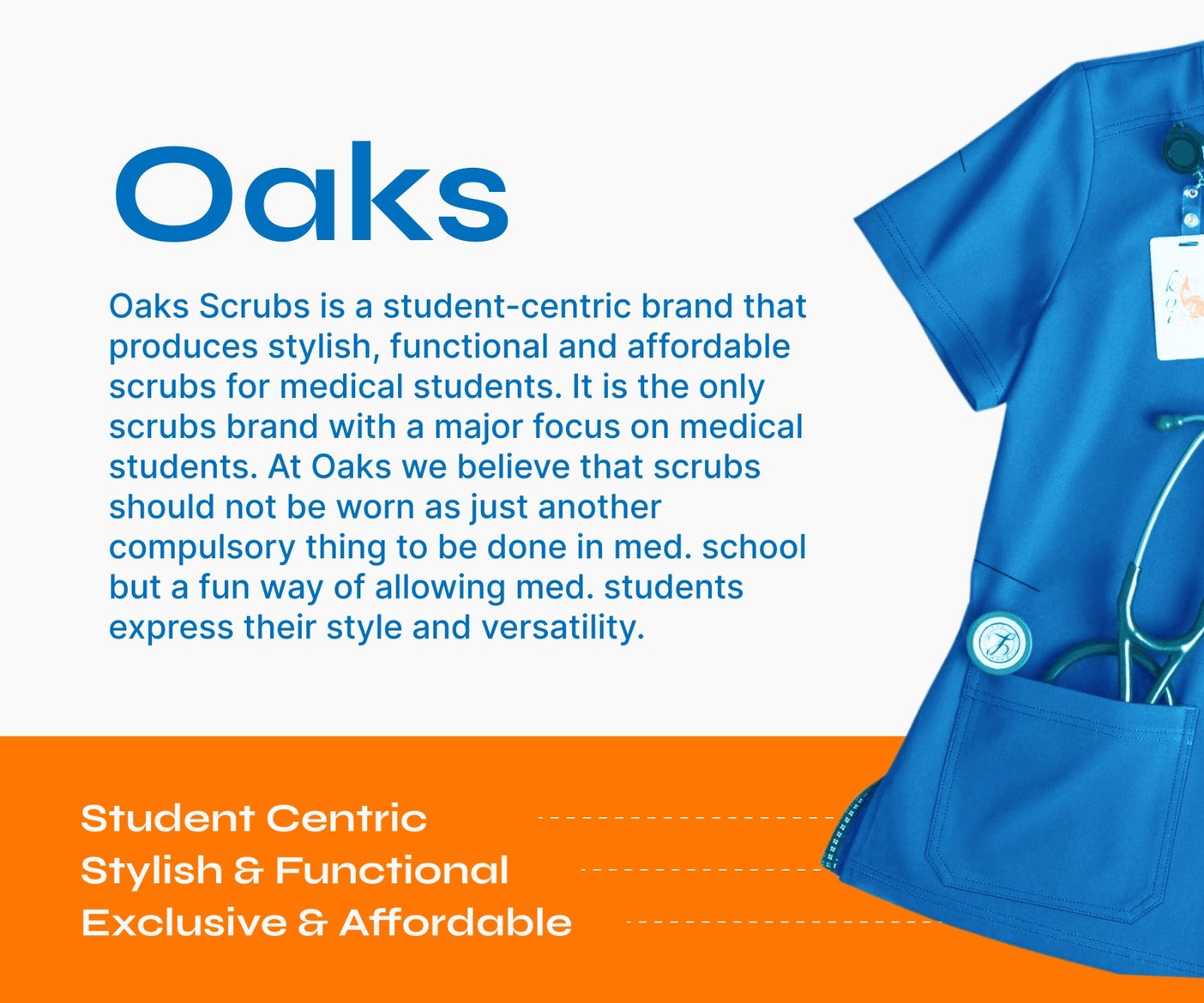
Oaks Scrubs is a student-centric brand that produces stylish, functional and affordable scrubs for medical students.
It is the only scrubs brand with a major focus on medical students.
The challenge
Oaks Scrubs was not created to be just another scrubs brand. It was designed with a clear purpose: to serve medical students who want more than generic uniforms.
The challenge was to translate this vision into a brand that feels exciting, stylish, and deeply connected to student life.
Oaks Scrubs needed to position itself as both functional and fashionable, while building a strong emotional connection with its audience.
The Process
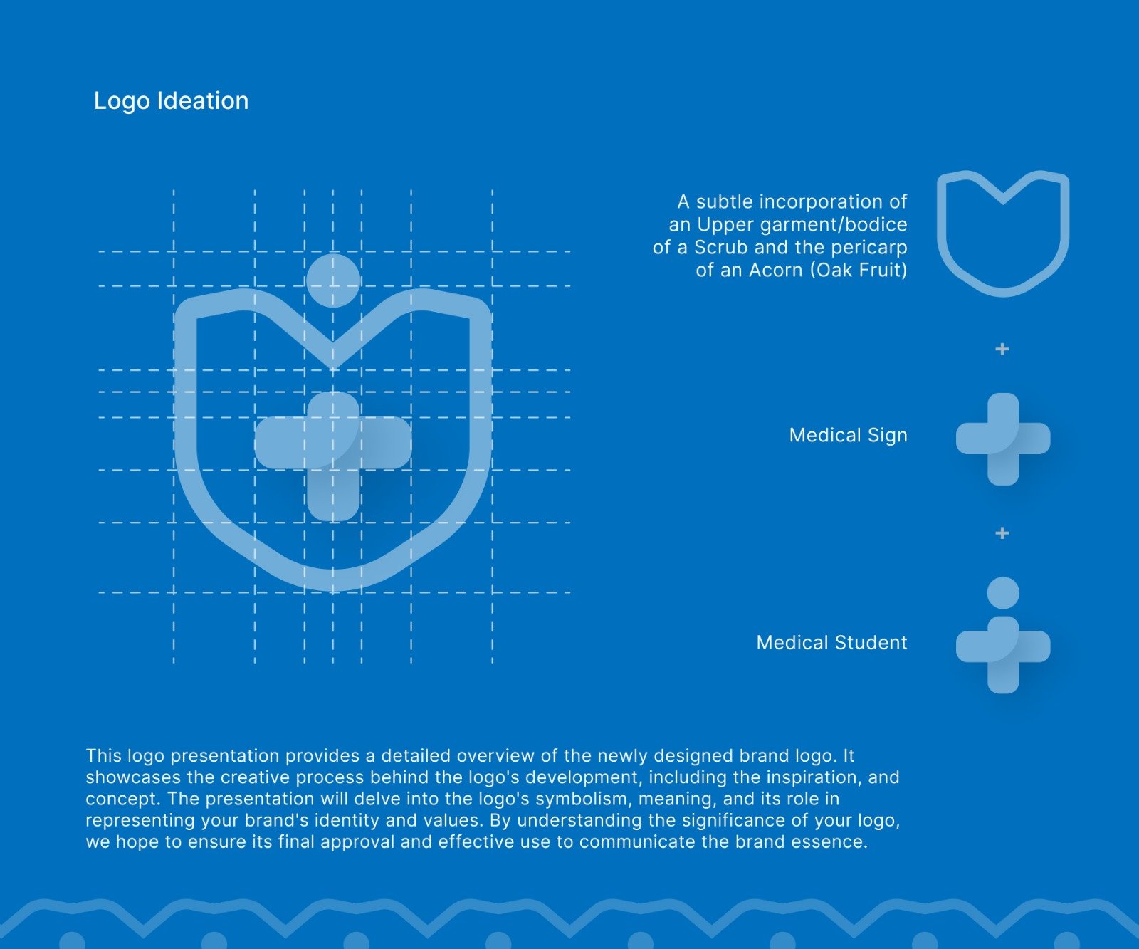
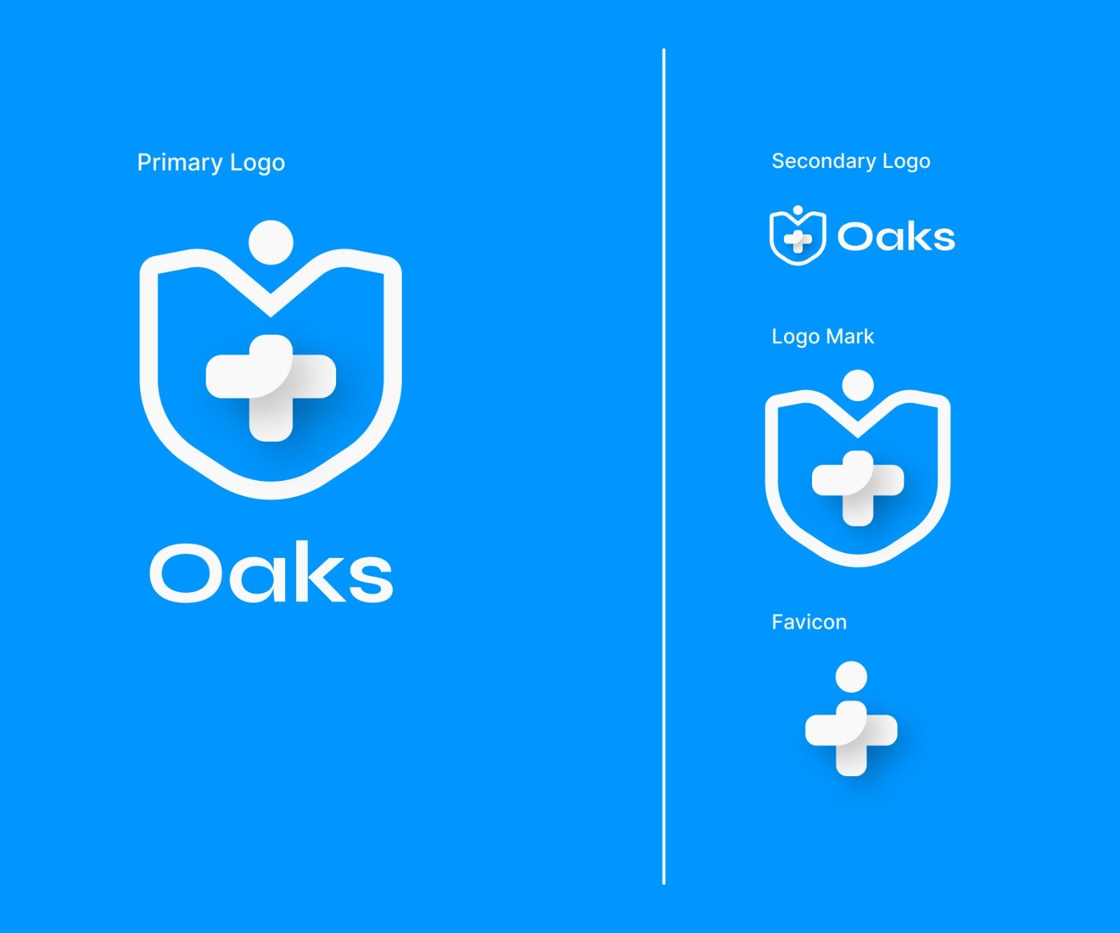
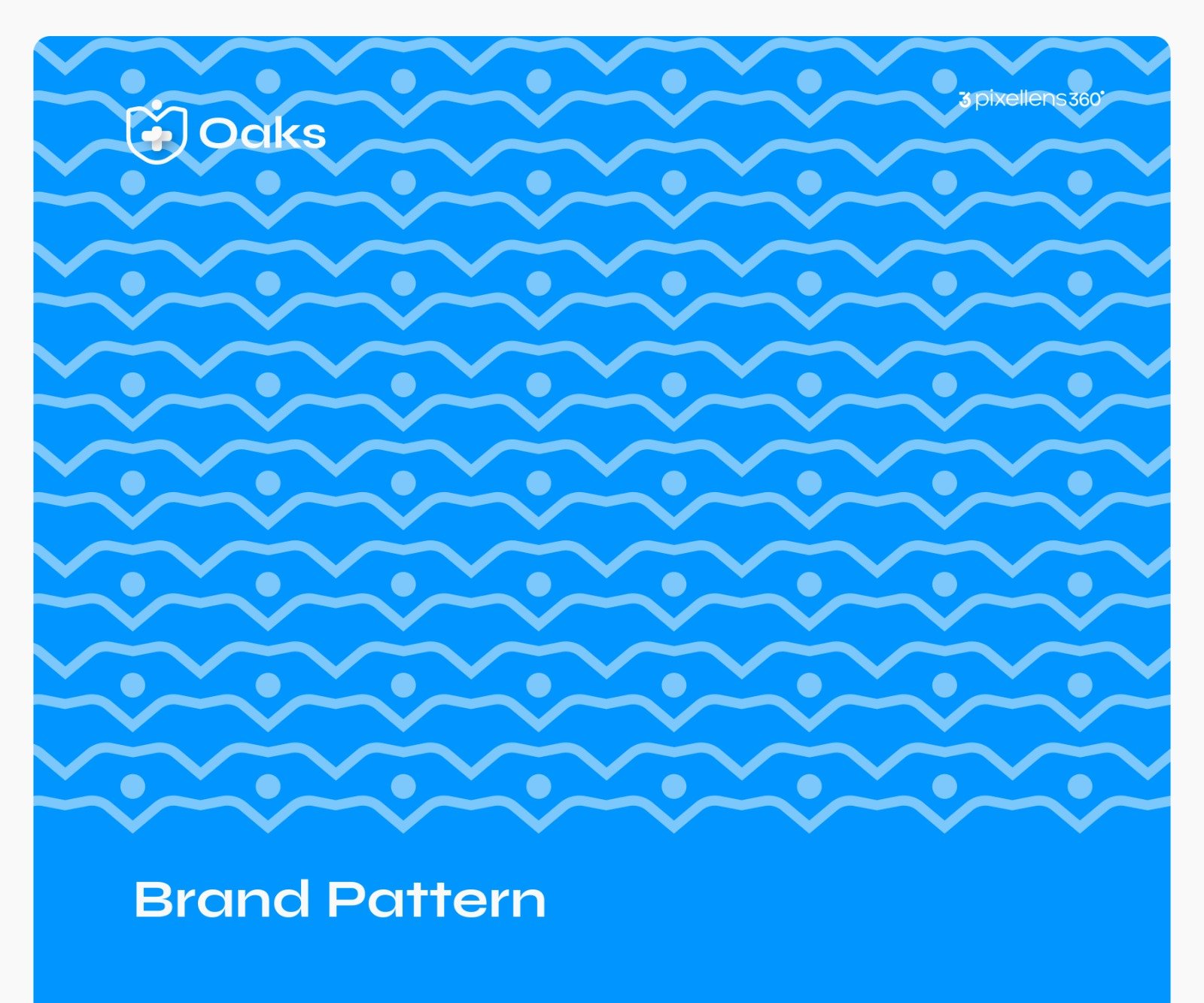
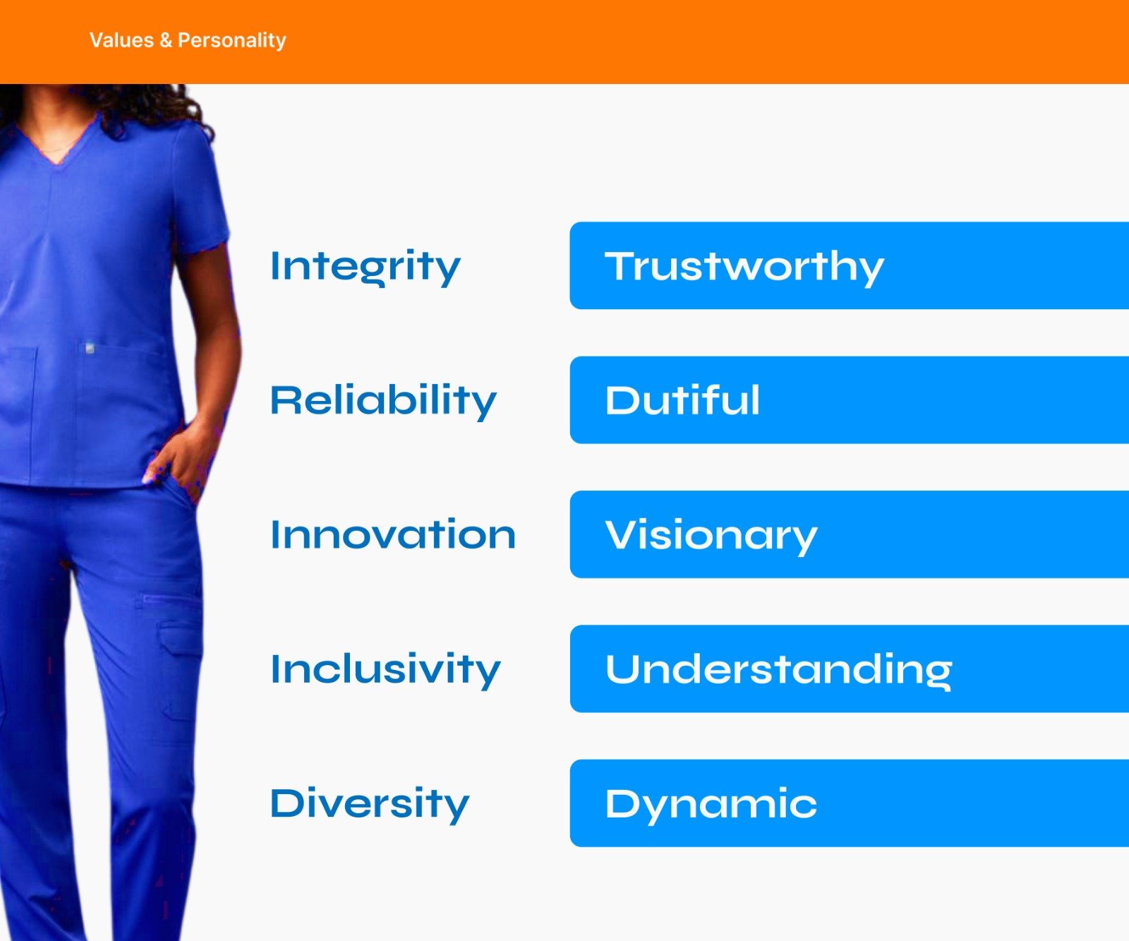
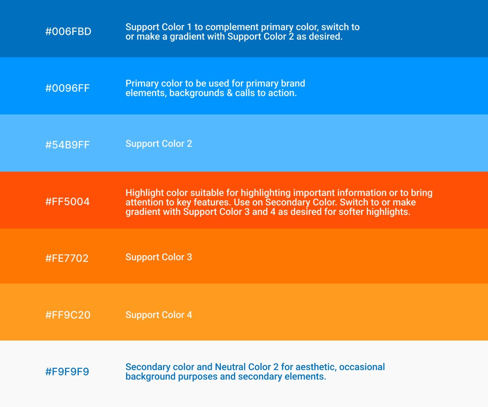
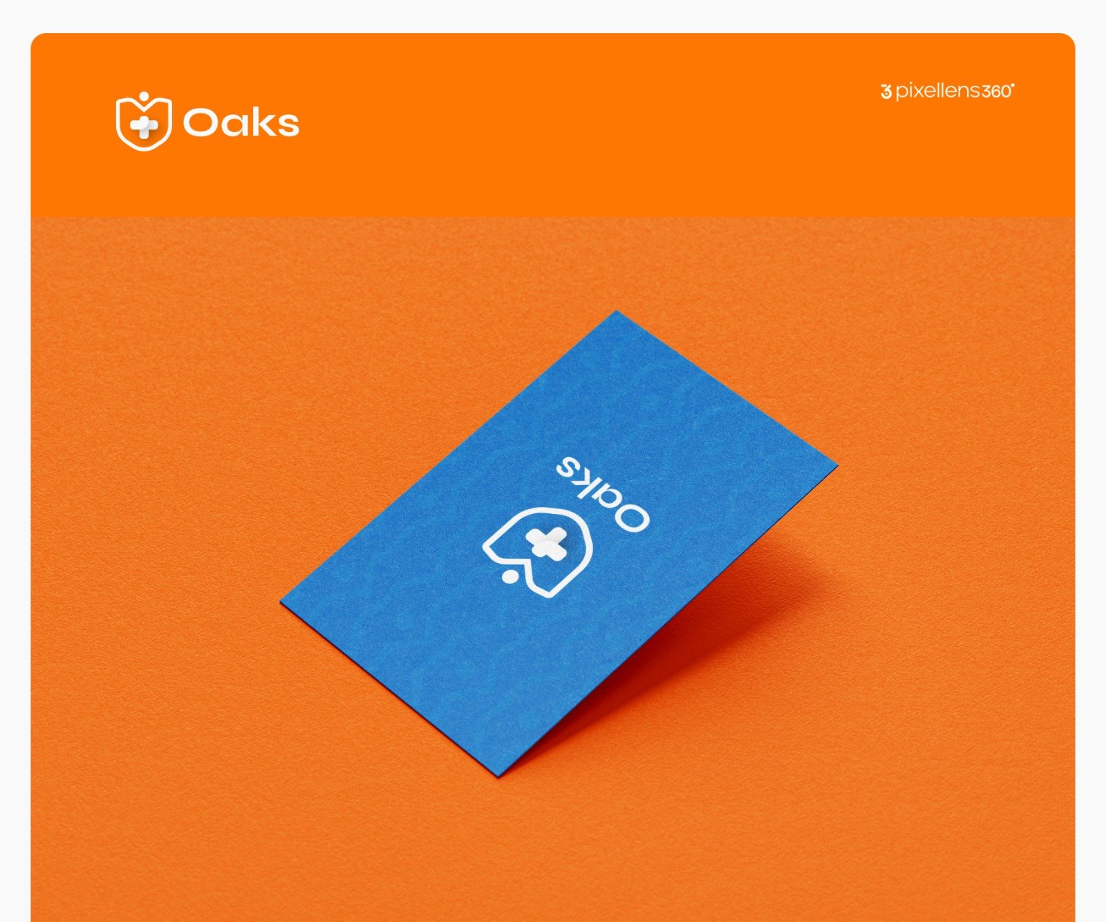
We grounded the design in Oaks Scrubs’ student-centric ethos. Inspired by bold Gen Z expressions and the everyday needs of med school life, we developed a combination logo in clean white, supported by a color palette of soft blue and a curated accent color that adds a touch of energy and youthfulness. The brand voice was crafted to be friendly, cheerful, and confident.
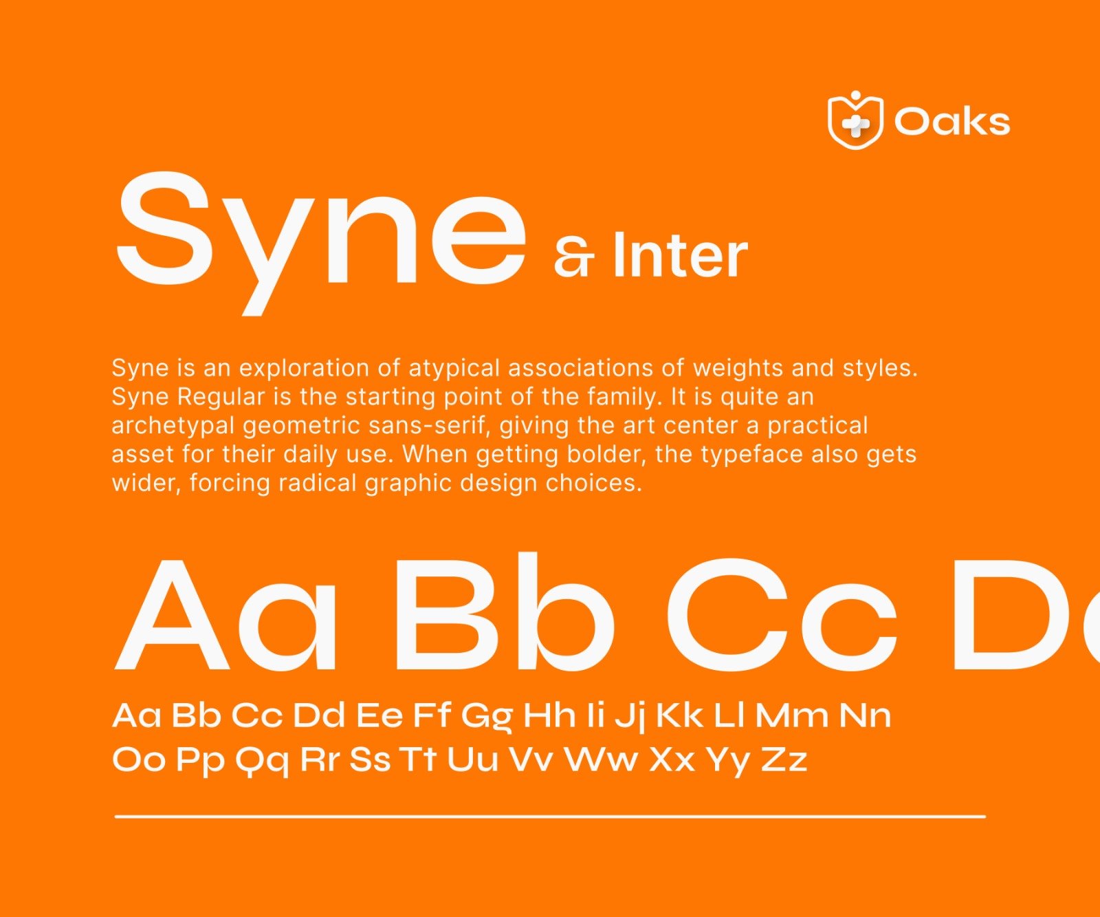
Visuals and typography were kept modern and sleek, complementing the idea that scrubs can be both practical and expressive. Beyond the visuals, we leaned into Oaks Scrubs’ community first mindset, ensuring the identity communicates belonging and warmth alongside innovation.
Result
Oaks Scrubs now stands as Nigeria’s most promising scrubs brand for medical students.
With its stylish approach, student-first focus, and clear positioning as a fun but functional lifestyle brand, Oaks Scrubs is more than a supplier. It is a trusted companion throughout the med school journey.
Logo Ideation
LogoMark
WordMark Style 1
WordMark Style 2
Soft Profile
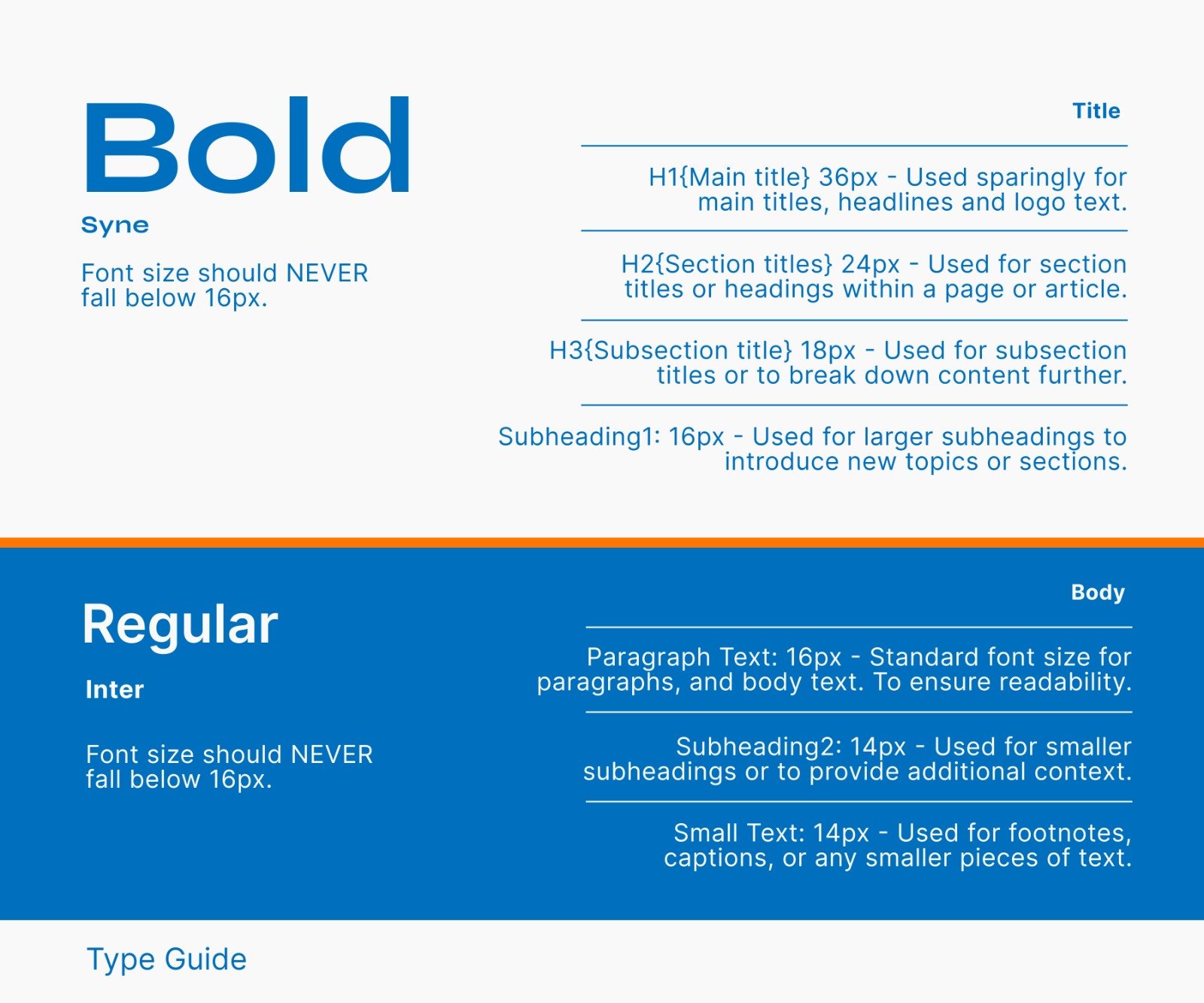
Style Guide
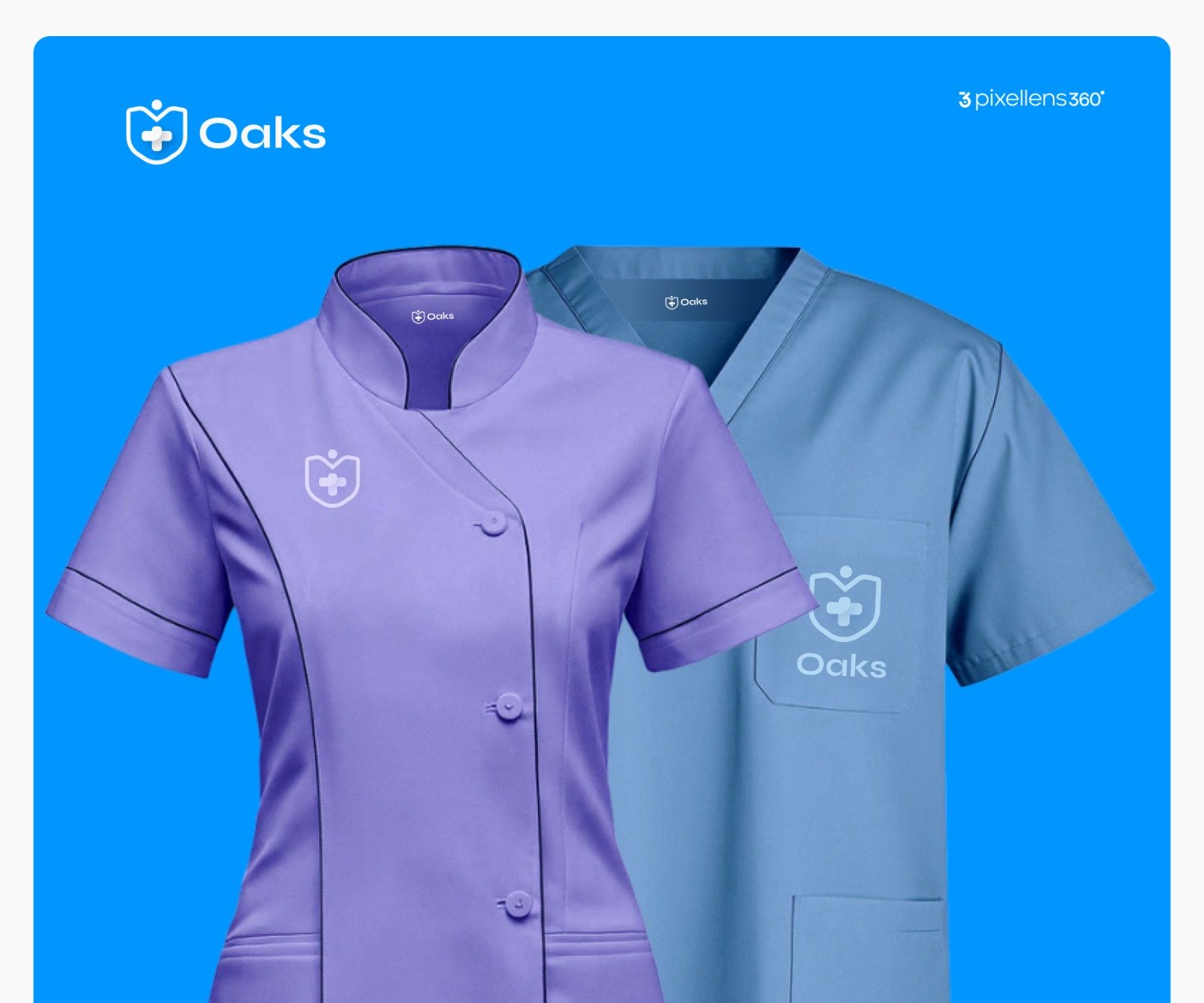
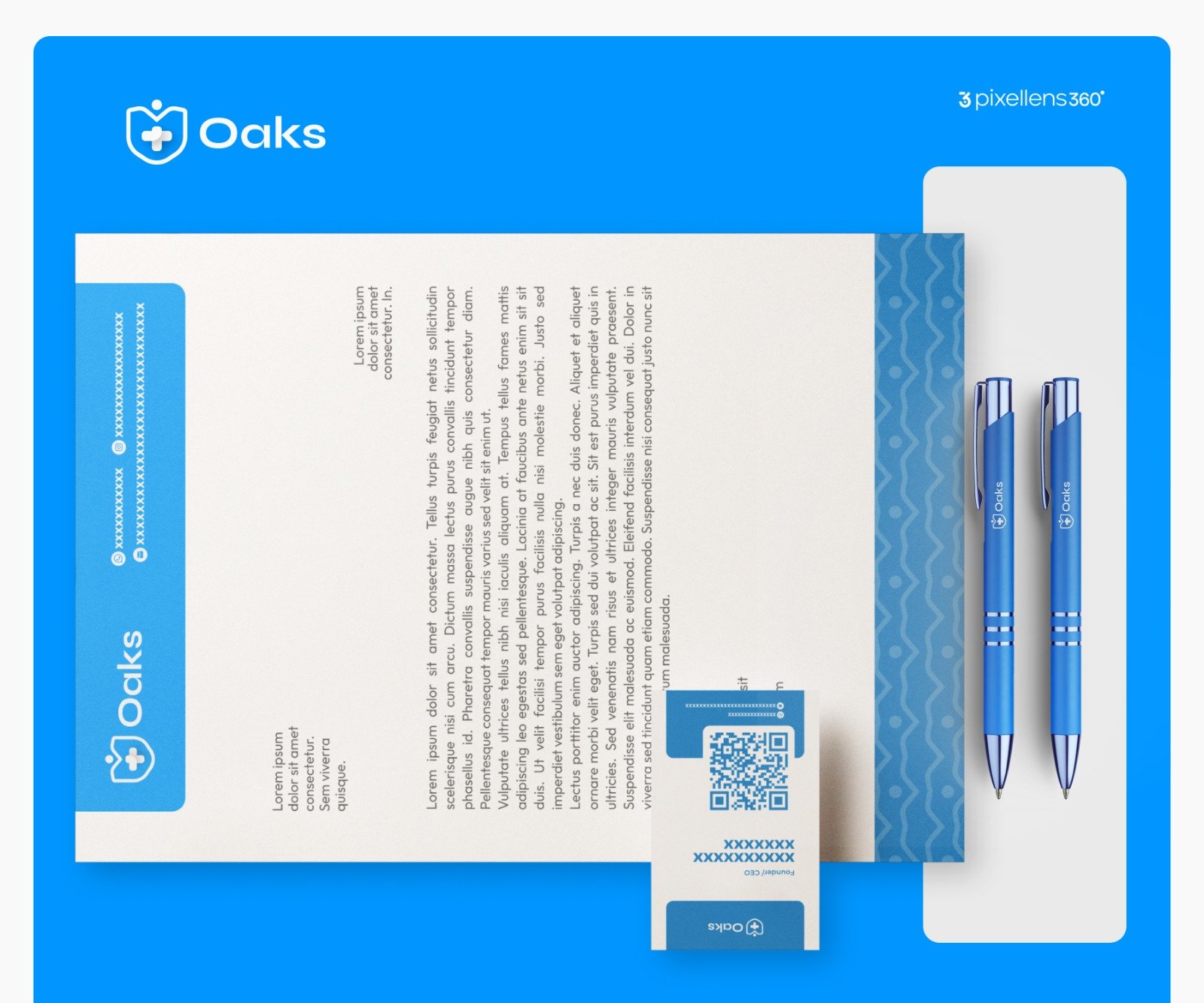
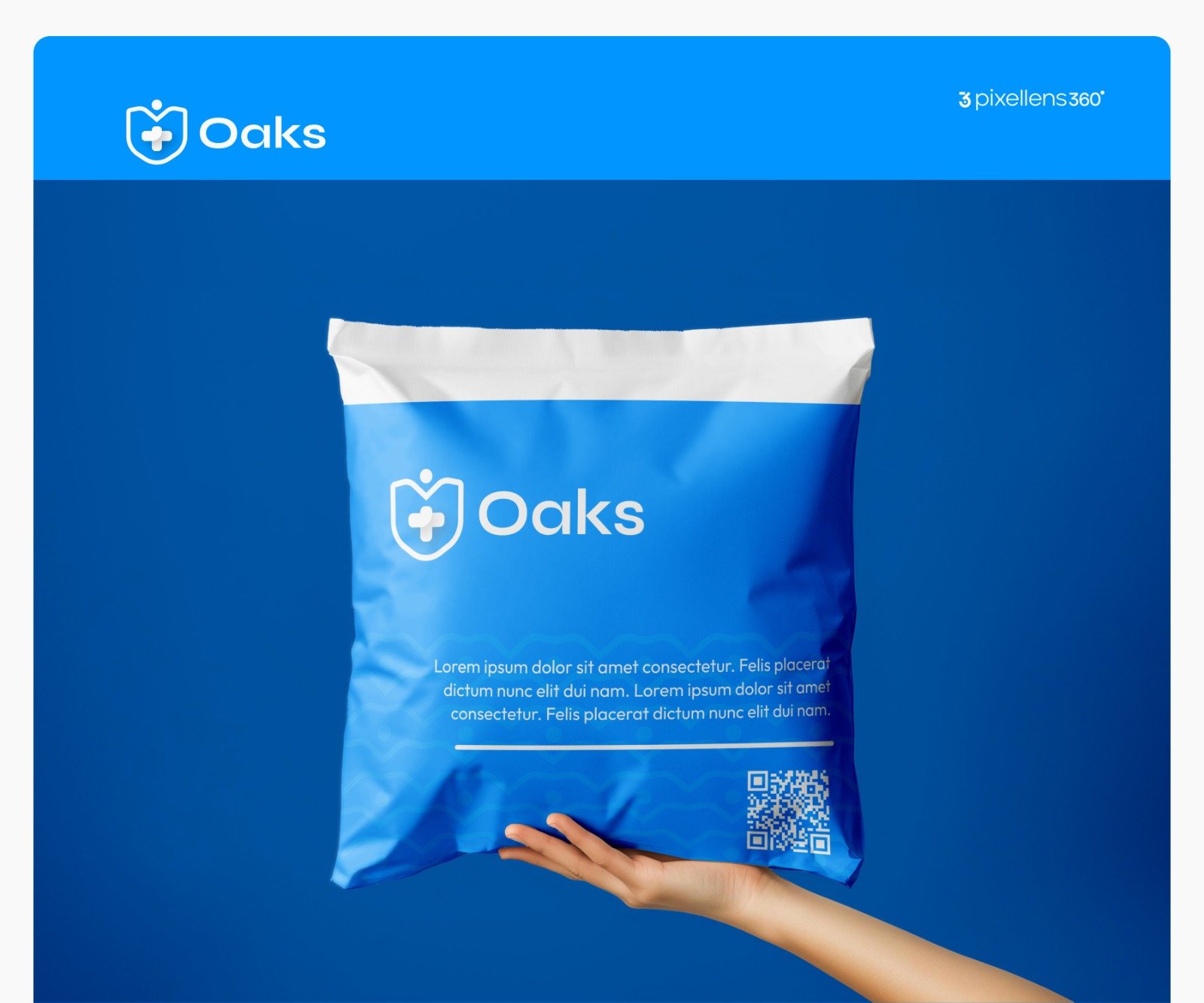
Mockups
Testimonial
When I gave ideation 360° my branding package, I was rest assured because I knew I’ll get nothing but the BEST and when I finally got it, I was not disappointed.
Everything was well detailed from the logo to the font to the colors, I was amazed.